About User Interface
This page explains the structure of the User Interface sub-project, provides links to its design resources, and outlines how to contribute to Flipper One's UI development.
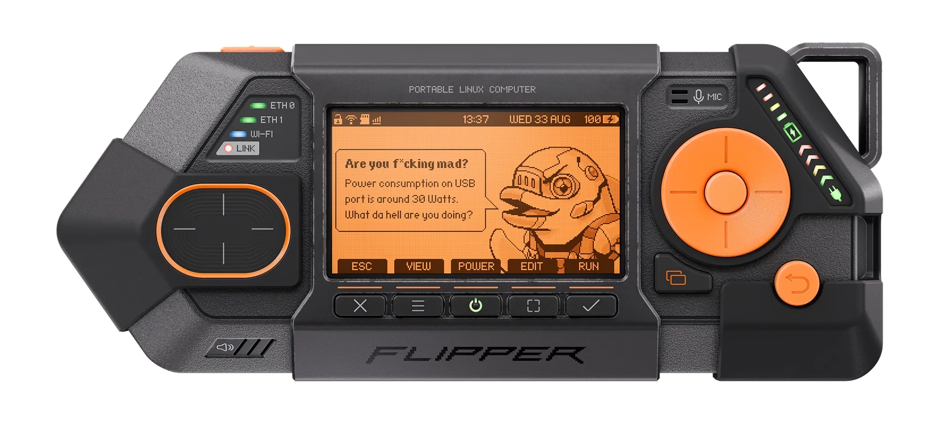
The User Interface sub-project covers the visual and interaction design of Flipper One: the on-screen UI, graphic elements, icons, illustrations, and the design assets used to build them.
The User Interface sub-project consists of:
- 🎨 Asset library on Figma — core components for building UI
- 🖼️ Main board on Figma — assembled UI layouts and design documentation
- 📁 GitHub repository — currently contains only a README
We'd love your feedback — look for tasks tagged help wanted in the task tracker, share your designs in the comments, or contribute directly to the docs.
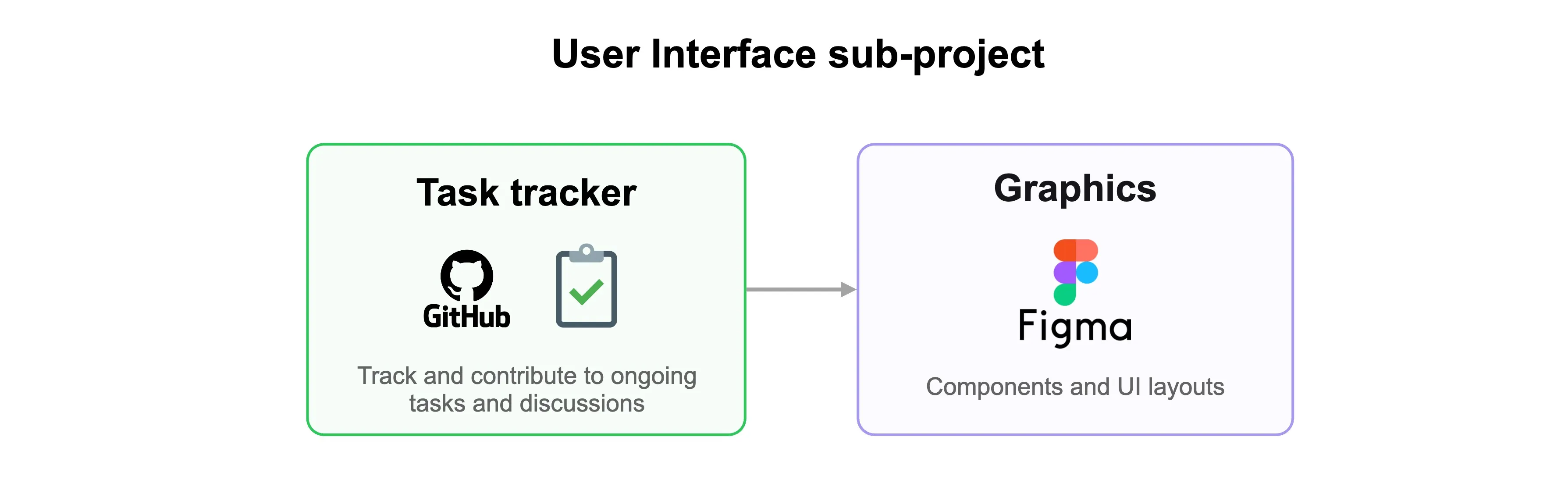
✅ Task tracker
All User Interface team tasks are tracked in the GitHub project Flipper One — User Interface. There, you can see what the design team is working on and follow progress and discussions.
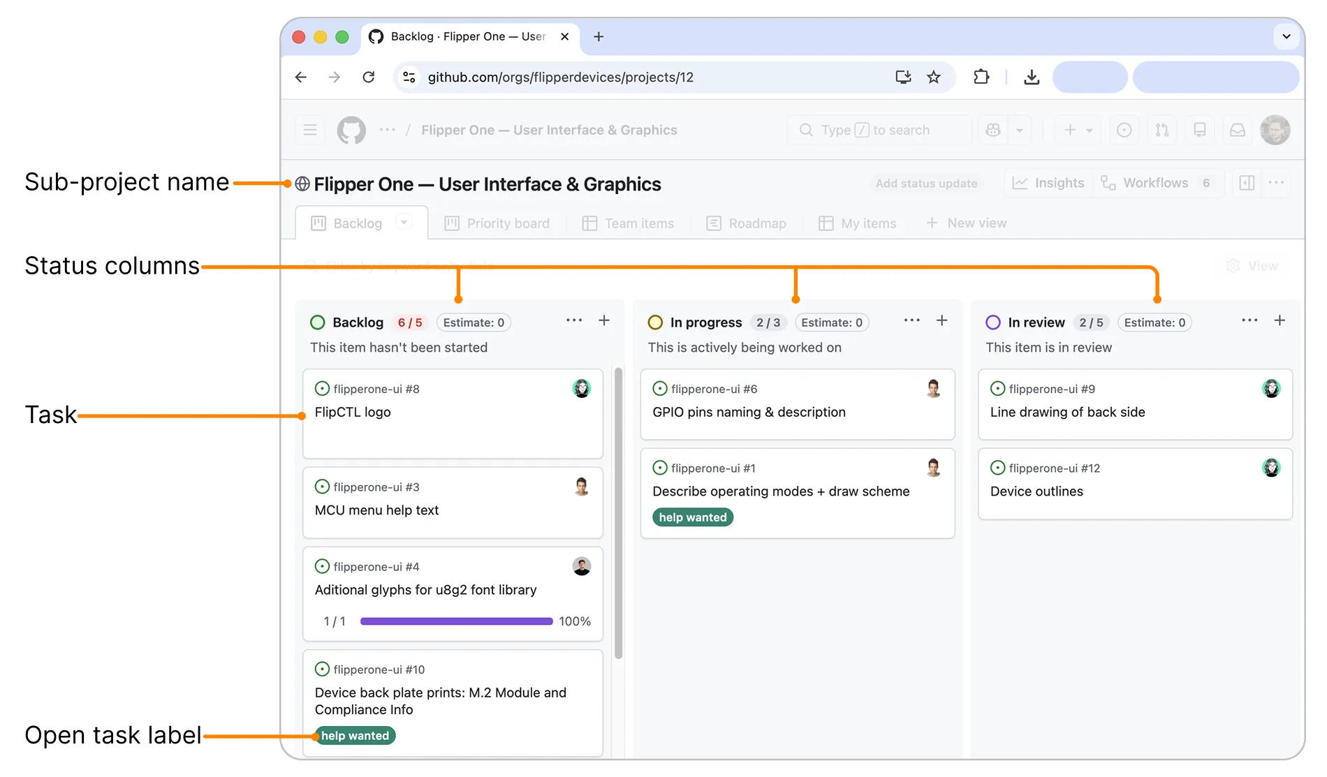
Some tasks are open to the community and marked with a help wanted label. You're welcome to join the discussion on these tasks or submit your design proposals — just make sure to read the Contribution guideContribution guide first.
🎨 Asset library on Figma
The Asset library hosts the core Figma components used to build Flipper One's UI. You can browse it in your browser without a paid Figma plan — just open the link.
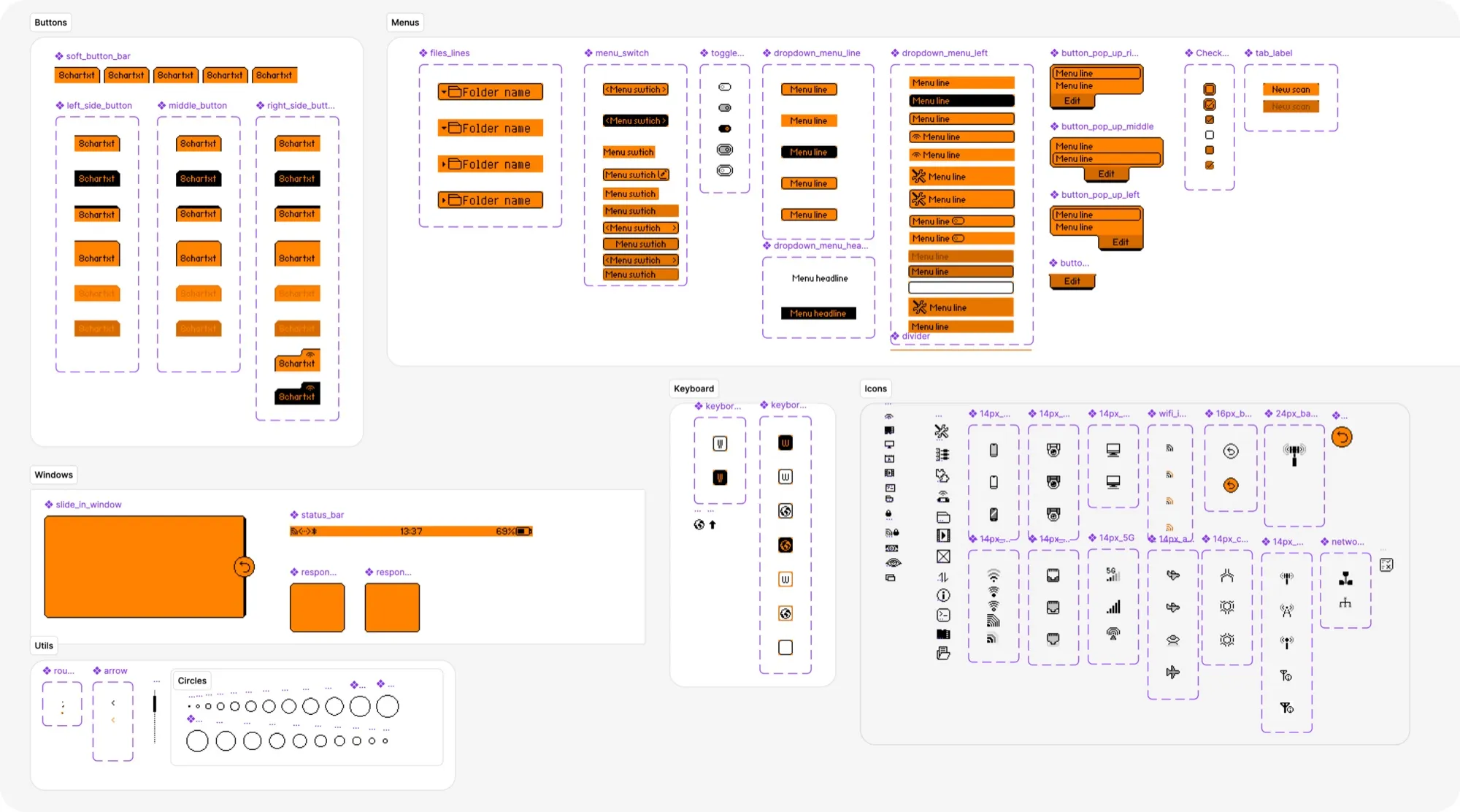
The library has two pages:
- UI — Prototype Assets — components for mockups and hypothesis testing inside Figma. Uses orange and black screen-like colors that mimic the Flipper One display.
- UI — Dev ready — components for building UI that will be shipped to the Flipper One screen.
If you have a paid Figma plan, you can add the Asset library to your team libraries for use across projects. See Figma's guide to libraries.
🖼️ Main board on Figma
The Main board hosts interface development, design assets, illustrations, and source graphics files.
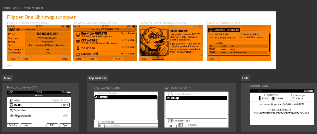
The Main board pages:
- Approved ✅: development-ready, assembled UI layouts.
- Documentation: illustrations and technical drawings.
- Selected: results of RND's and highlighted options.
- UI Live Preview: pre-assembled UI layouts for look-and-feel tests on the device.
- UI Prototyping and RND: UI drafts, tests for feedback sessions and discussions.
- Device prints: interface printed labels, silk graphics development.
Display constraints
Flipper One's display has specific constraints all UI designs must follow:
- Resolution: 256 × 144 px
- Color depth: 64 shades of black (6-bit grayscale)
- Backlight: orange LCD
- Pixel-perfect rendering: UI elements must align to whole pixels — sub-pixel rendering is not supported
Keep these in mind when designing screens, icons, or illustrations — anything that doesn't respect them won't render correctly on the device.
Fonts
The UI uses two fonts:
- Born2bSportyV2 — primary UI font.
- haxrcorp4089 — secondary UI font.

Prototypes (deprecated)
Earlier prototypes based on ProtoPie are deprecated — they were used when we couldn't prototype directly on the Flipper One screen.
How to contribute
To contribute to the User Interface sub-project, you need to have a GitHub account. You can create one on the GitHub website.
⚠️ Contributions only — no flooding
To keep collaboration productive, please keep comments on-topic. Open tasks are for contribution-related discussion only. If you have an idea or concern, first turn it into a concrete contribution and share it as a comment on a task. For general questions or discussions, you're always welcome to join the conversation on social media or Discord!
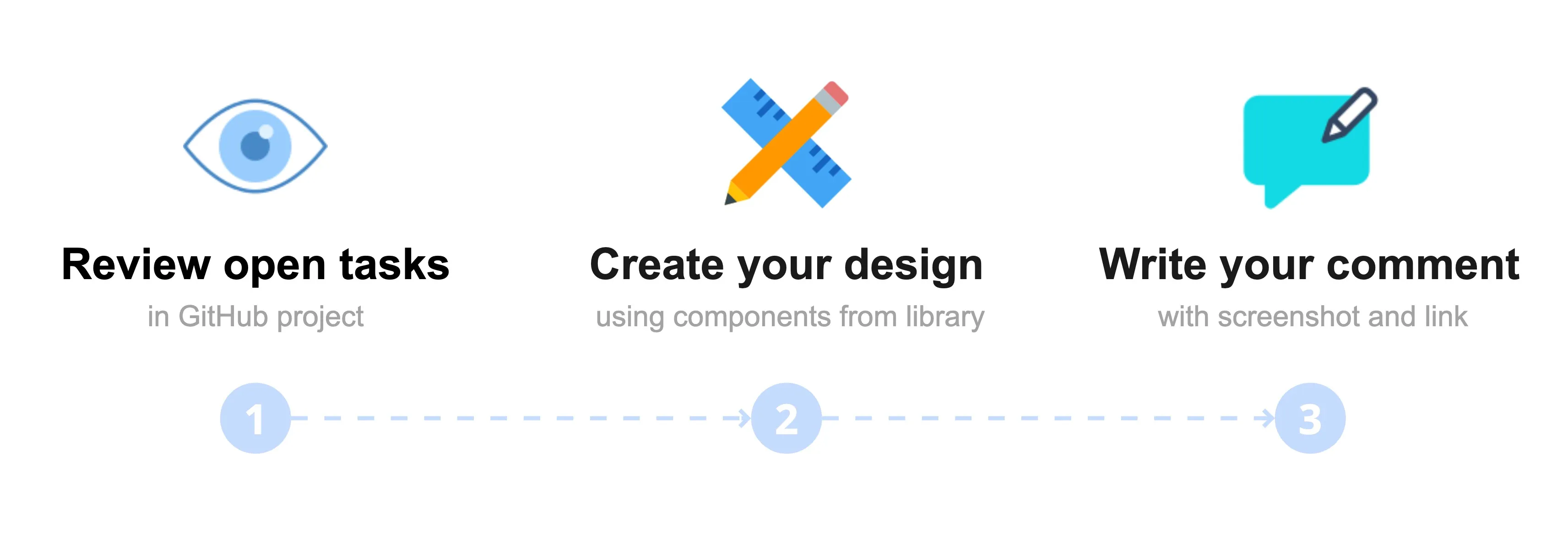
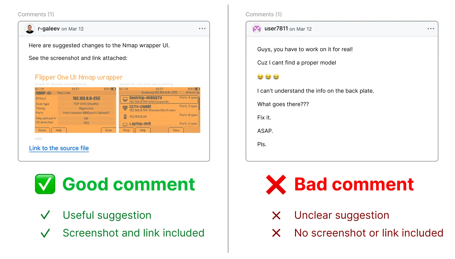
The User Interface sub-project accepts contributions through comments on open tasks — submit your design proposals as comments on a help wanted task, including a screenshot and a link to your Figma source file.
Pick a task. In the User Interface GitHub project, browse the open tasks and click the one labeled help wanted that you want to contribute to.
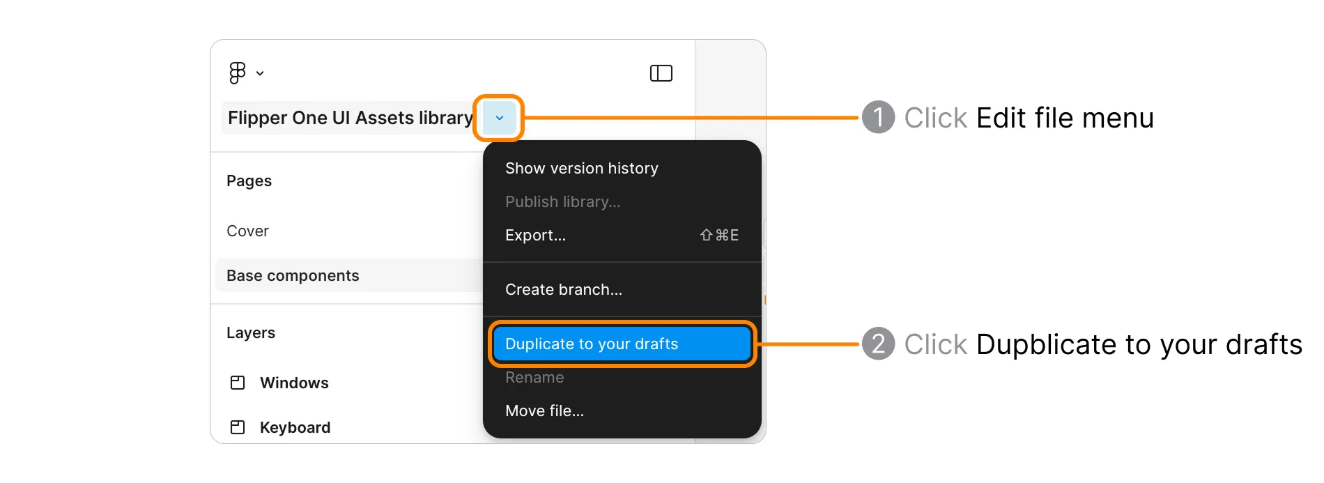
Create your design. Use components from the Asset library as a base. You can duplicate the Main board into your drafts to reuse ready screens — click the dropdown next to the board name and select Duplicate to your drafts.
Allow anyone to view your board. In Figma, open your board's share settings and set general access so reviewers can open your design from the link.
- Click Share.
- Set access to Anyone can view.
- In Share settings, enable Viewers can copy, save, and export.
- Click Save.
- Click Copy link.
Write your comment. Describe your changes, attach a screenshot of your design and paste the link to your Figma source file.
Attachment size limit:
- Images: 10 MB
- Videos: 100 MB
Click Comment to submit.
We review all design proposals carefully! We may ask additional questions in the task thread, so please watch for GitHub notifications in your email.